About edges
Depth |
Composition |
|
Depth is the distance between the closest and farthest objects in a photo that appears acceptably sharp.
|
Composition is the place something is in photograph.
|
Cropping |
Focus |
|
Cropping is removing unwanted areas from a photograph.
|
The position at which rays of light from a lens converge to form a clear and sharply defined image on a focal plane.
|
FramingFraming refers to using elements of a scene to create a frame within your frame. For example, you might shoot through a doorway, pulled back curtains, branches, fences, tunnels, or arches to highlight your subject.
|

Similarities
|

Differences
|
|
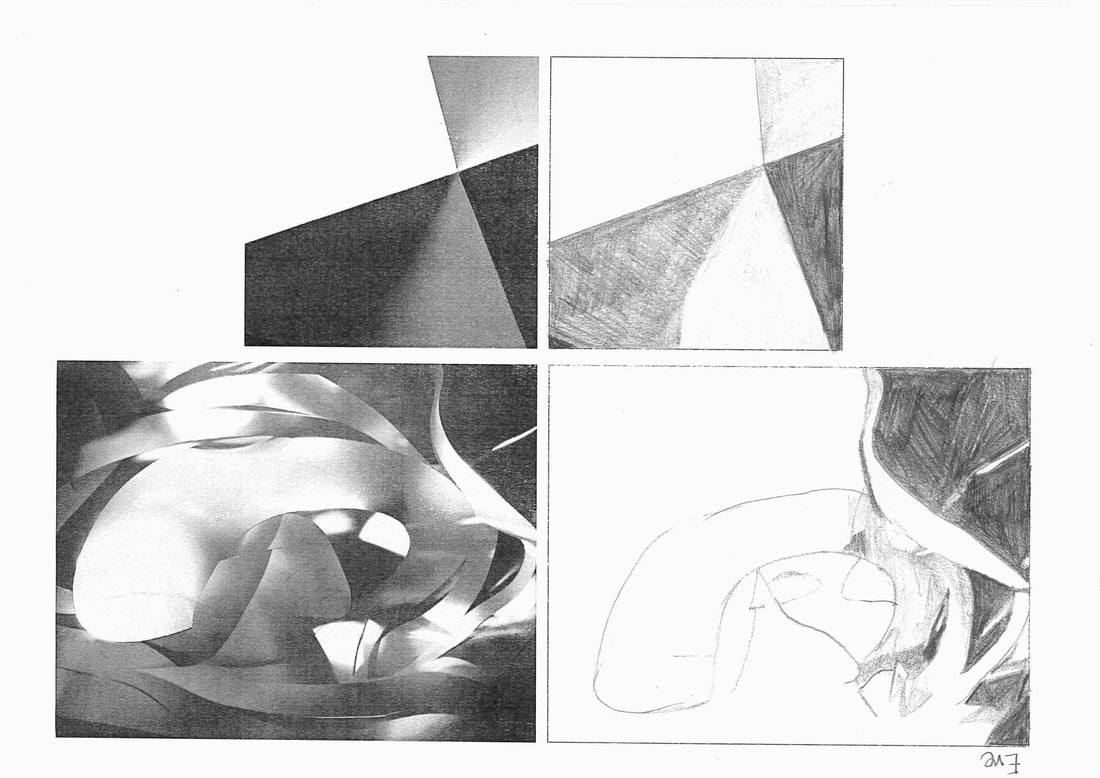
Noticing the light.
I
What did I do?
started with the first picture, I then positioned where the lines are and then shaded them in. The second picture was alot more of a challenge. I started off with observing the picture and then once I took in what the picture was about I then picked up my pencil and begun to draw the shapes. Lastly, I started shading.
Why did we have to do this drawing?
We had do this drawing to understand the meaning and difference between light and dark.
concertina book


|


|

Vjeko Sager - from the series Antimatter,2008. |

Francis Bruguiere - cut paper abstraction c. 1929 |
Francis Bruguiere
I think the Francis Bruguiere photograph was made by cutting delicate cuts along a piece of paper. I think he made the shadow effect on the photograph by doing careful and soft folds. I think when Bruguiere was taking this picture he mainly focused on the contrast between light and dark.
Vjeko Sager
I think the sager images were simply made by using paper and cutting simple lines across the paper. This image is much less complex than the Bruguiere image and is a very minimal and bleak photograph.


Edges assessment.
Why did I choose these photographs?
I chose these five photographs as they stood out the most to me and I think they all connect in some sort of way. I also chose these images as I think each one represents something different and they can all be interpreted in different ways. If I pay close attention to these images I notice more and more similarities and differences each image share. For example, they all have taken in and noticed the difference between light and contrast. A difference I notice when looking at the images is each photographer has all displayed the vocal point of this photograph very differently. The one question that came to mind when looking at these images for me was what did they learn, if anything, from taking these photographs?


I had around thirty images to choose from for which ones I wanted to re-photograph. But I decided to choose these five images purely because they looked the most fascinating to me and just had something about them that stood out to me. I also liked these images because they did not have to much going on and you could clearly see the vocal point of each image, which I liked. When I was deciding where each photograph should be taken I chose the locations that I personally thought would've related to each image in some sort of way. I decided to take all of these photographs inside as I think they fitted with each image best. When taking these particular images I decided to really focus on the light and the placing/backround of each image. When taking the images the one thing I think I could've done is played around more with different angles.
My photo-sculpture


www: |
EBI: |
|
|
My First Photoshop Experience


For this task, we were asked to photoshop our sculptures onto a photograph of an area in the school. To do this I used the lasso tool to cut out my sculpture. I then copied this and then placed it onto the given picture of Thomas Tallis. I then decide to play around with the brightness and contrast to finalise my image.
WWW:
|
EBI: |
|
|
|
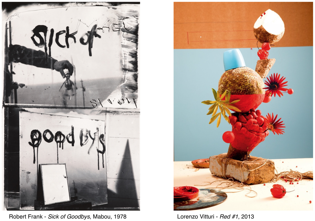
The first word that comes to mind for me when looking at the photograph by Robert Frank is the word 'sinister' because it has a very dark and mysterious atmosphere. I think this photograph is meaningful and might make the viewer feel melancholy. Perhaps Robert Frank also felt melancholy when he made the photograph. The more I look at this photograph the more questions I have for the artist. This is because the photograph is ambiguous. What exactly was the artist feeling when he took this photograph? Was there a reason for taking this photograph? Where was it taken?
|
I think the photograph by Lorenzo Vitturi has a very vibrant, colourful and happy mood to the photograph. The first thing that I notice about this photograph is how the colours go so nicely together. I think their are many meanings behind this photograph. For example, I think the cool blue could perhaps present the sea and maybe the red presents the heat?
|
similarities between these two photographs:
- I think there are hidden meanings behind both photographs
- Both of these photographs were both taken in portrait
- Both images are interesting
- They are both abstract images
differences between these two photographs:
- They both give off very different atmosphere's
- Frank's photograph is in black and white whereas Vitturi's is in colour
- The focus of both both photographs are almost opposite
- They both have very different meanings
20 minute Exercise.


WWW: |
EBI: |
|
I think I have paid attention to detail very well.
|
In some of my pictures I do not think it was necessary to use flash as it has taken the colour out of some of my images.
|


Paper sculptures/colour sculptures-Frank Gehry response.


WWW: |
EBI: |
|
|
